
client
stacy garfield
bio
Stacy is a former aerospace engineer, who has taken a step back from that career to pursue wedding and elopement photography. She has had this dream for a while to start a group to mentor young women in STEM—Science, Technology, Engineering and Math.
She wants to do the individual mentoring in a nature-based setting. Through hiking or camping retreats. Stacy herself is an outdoor enthusiast. Her main photography clients are “adventure elopements”—getting married while hiking or doing some sort of other outdoor adventure. She also runs a nature-based Instagram photography account.
market
Women and non-binary folks in the Pacific Northwest, aged 20-35
Educated, or those with desire to pursue education but for some reason have been shut out of higher education
Interested in different kinds of sciences
Interested in pursing leadership roles
Interested in nature
Likely in an internship or in their first few years into a new career
style inspo
Stacy was fairly open minded, but she definitely wanted something nature based, and to include a mountain of some sort.
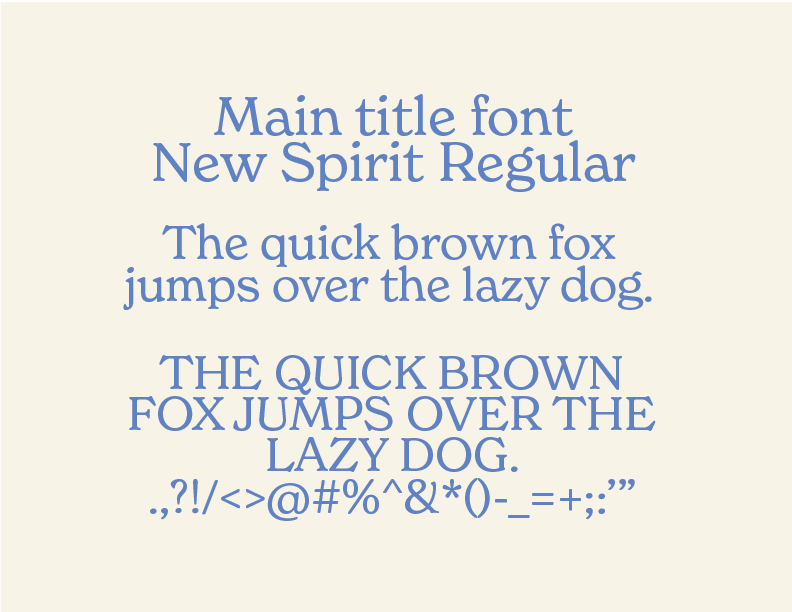
I wanted to use “New Spirit”—I love the look of it and I think personality wise it would attract young women and non-binary people who are specifically interested in nature.
location
north bend, washington, united states


sjg achievers
process
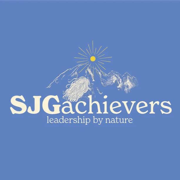
In terms of mentorship organizations that are similar, they often have a vague human figure that’s “reaching for the stars.” I wanted to avoid that cliche, but I wanted to find a concept that was aspirational. I thought of the concept of a woman looking on to a mountain, as if going to the top of it was her goal.” We see the sun rising as well, as a symbol of optimism.
I wanted a more illustrative, organic look to the logo, so I ended up sketching it all on the Procreate app on my iPad. I used Mt. Baker, which is Stacy’s favorite mountain in the Cascade Range of the Western United States and Canada.


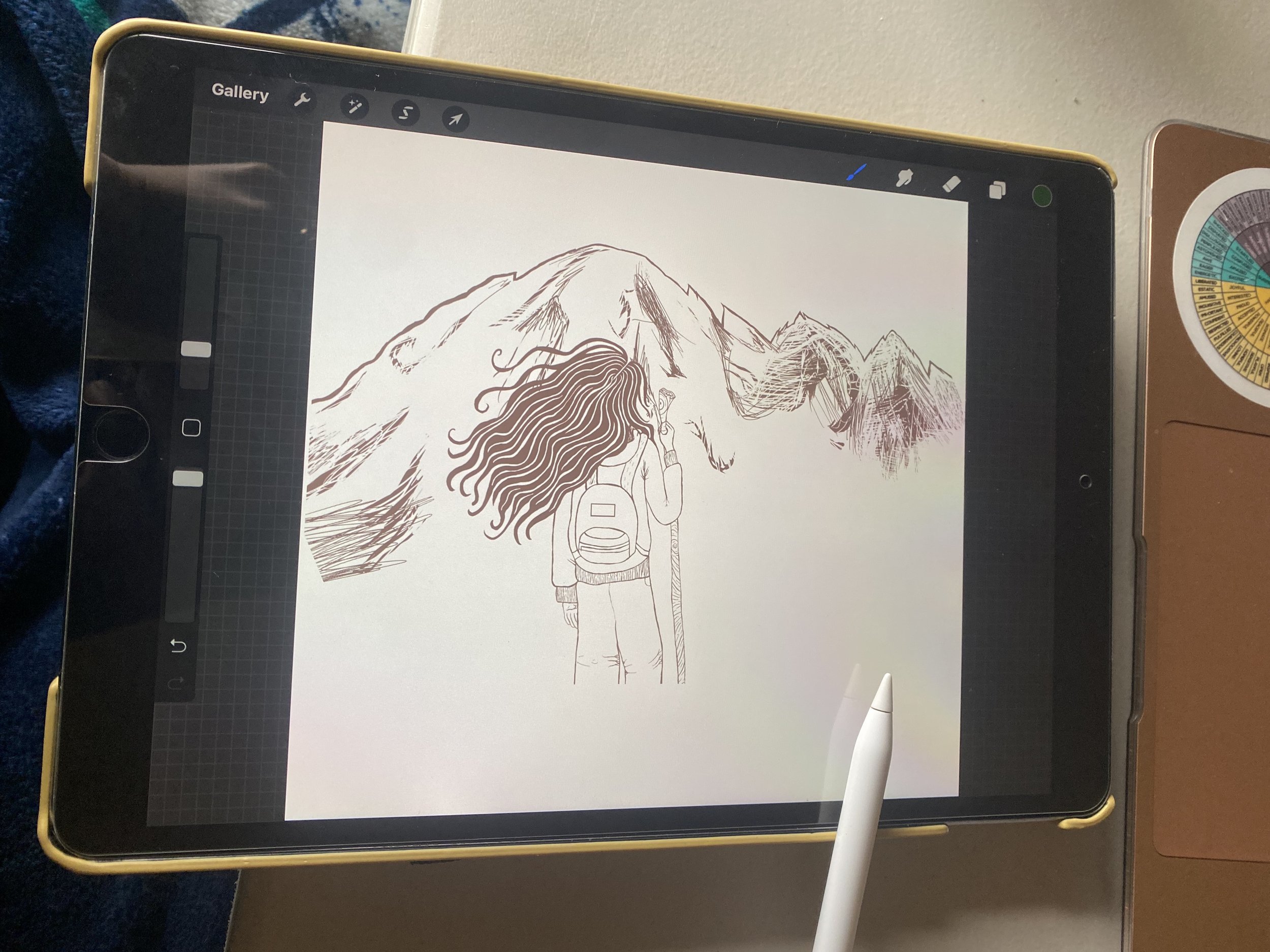


I started working on the logo in color, but quickly realized that this illustrative technique wouldn’t quite work unless Stacy had access to high-quality printing. It was a bit too detailed to be used as a logo. I invested too much texture into the logo, where that could be better used in branding art as opposed to the logo in terms of traditional design principles.
first look


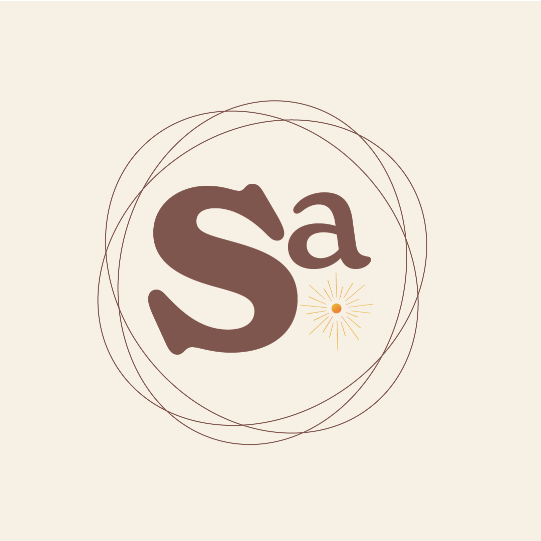


For this look, I wanted to create some additional elements that would relate to other forms of science, aside from basic nature and earth science. I made these rings around the logo, to represent electrons on an atom form.
You’ll see the “Sa” logo, that looks like it could be an element on the periodic table.
I originally went with a yellow, cream and orange-yellow color scheme for more of an organic appeal. This may be a bit more deserty than what Stacy expected, and so she wanted to add blue to the mix, because it’s her favorite color. She also requested some green, as Western Washington is so uniquely green in its nature.
The sun helps incorporate some of the elements of her own aerospace STEM career path, as it is in the sky, and space. I briefly considered putting a satellite in the sky because that was her specialty, but it felt a bit too cluttered with the overall look.
final look


my learning moments
This is the first brand I designed that had quite a bit of illustration requested, and technology-wise I learned quite a bit when working between programs like Procreate and Adobe Illustrator. I learned while doing, and I had to make sure I scheduled myself a bit of extra time on the project so that I could learn while doing.
I was happy with the trust that Stacy and I built together. She knew that I was just starting out, but she trusted my vision and it worked out well.