midlife skin

client
kate tschoepe
bellingham, washington, united states
location
bio
Kate is now approaching an age where a lot of skincare products are being marketed to her that are based upon shaming the fact that she is aging. Making skincare products have piqued her interest lately, and she wants to create a luxury beauty brand that focuses on embracing age, not trying to get rid of it.
In other words, taking care of and treating the skin you have, rather than trying to erase it.
She’s a big fan of vintage-inspired art, and she is drawn to my vintage-inspired brand aesthetic, May Zender Design. She loves Art Deco and Art Nouveau.
market
Women aged 35-65, but could extend to fem-identified people of the same age range as well, various racial and ethnic backgrounds
Leaning wealthier
Appreciator of the arts and local businesses—is willing to spend extra money if it means that they are supporting small business
Those who appreciate a beauty brand that’s not based upon cultural shame of aging
Starting off targeting Pacific Northwesterners, but could expand nationally in the future


style inspo
Big into vintage style, especially art deco and the feminine figures of art nouveau, a little old Hollywood
Love starburst patterns
Loves moody color tones
Loves celebrity designer and public figure Stacy London and her philosophy on embracing aging. Kate would like to incorporate some sort of reference to her in the branding art.


process
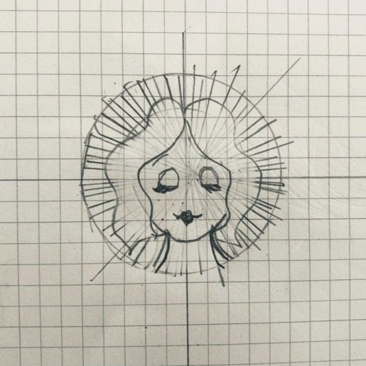
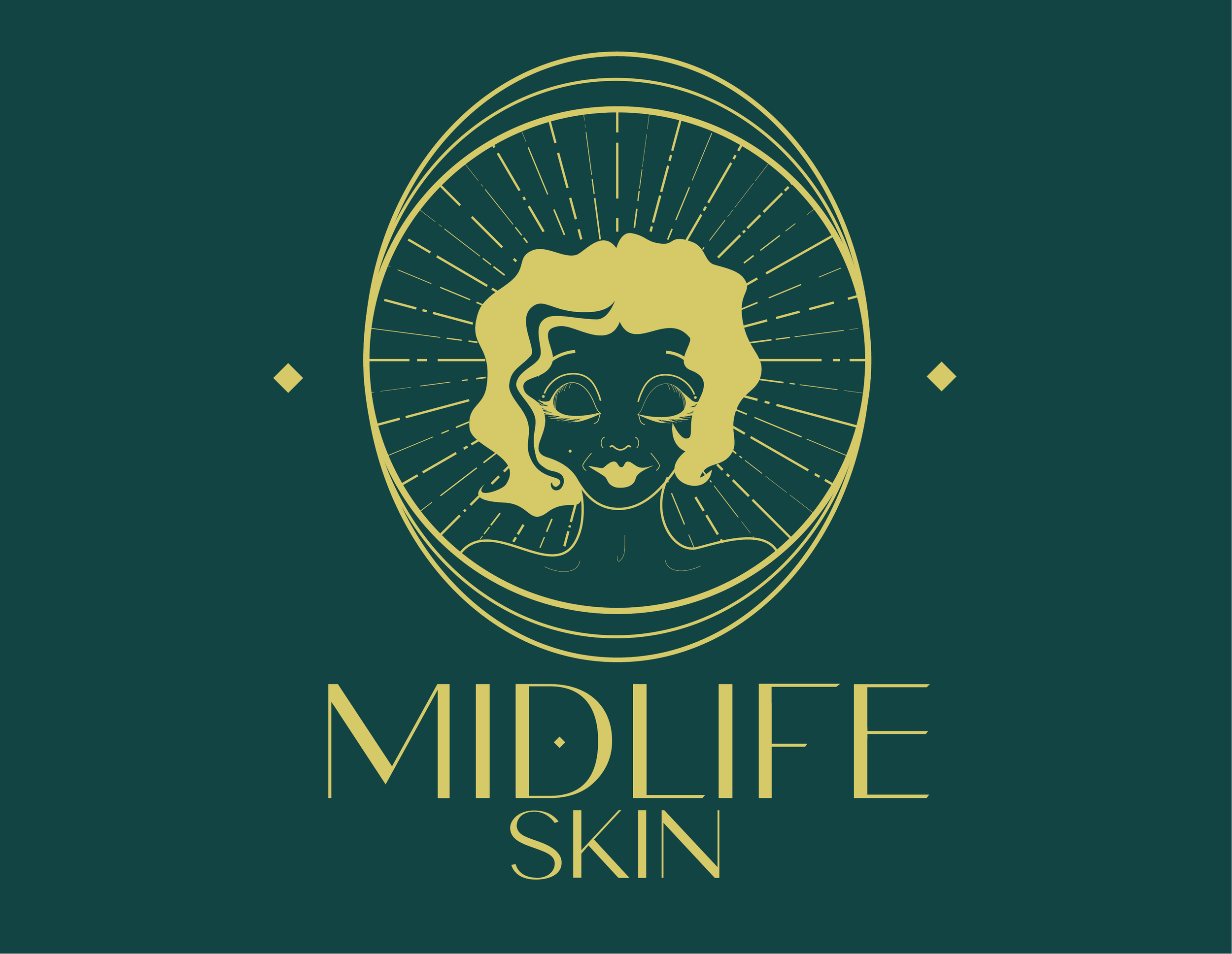
My idea was to create an image of a woman in the style of Art Nouveau and Art Deco. I wanted her to have the classic signs of aging… graying hair, fine lines and wrinkles. But for them to be portrayed in a glorified light.
The sunburst effect and circles around her mimic the halos of saintly figures from paintings in the Renaissance period.
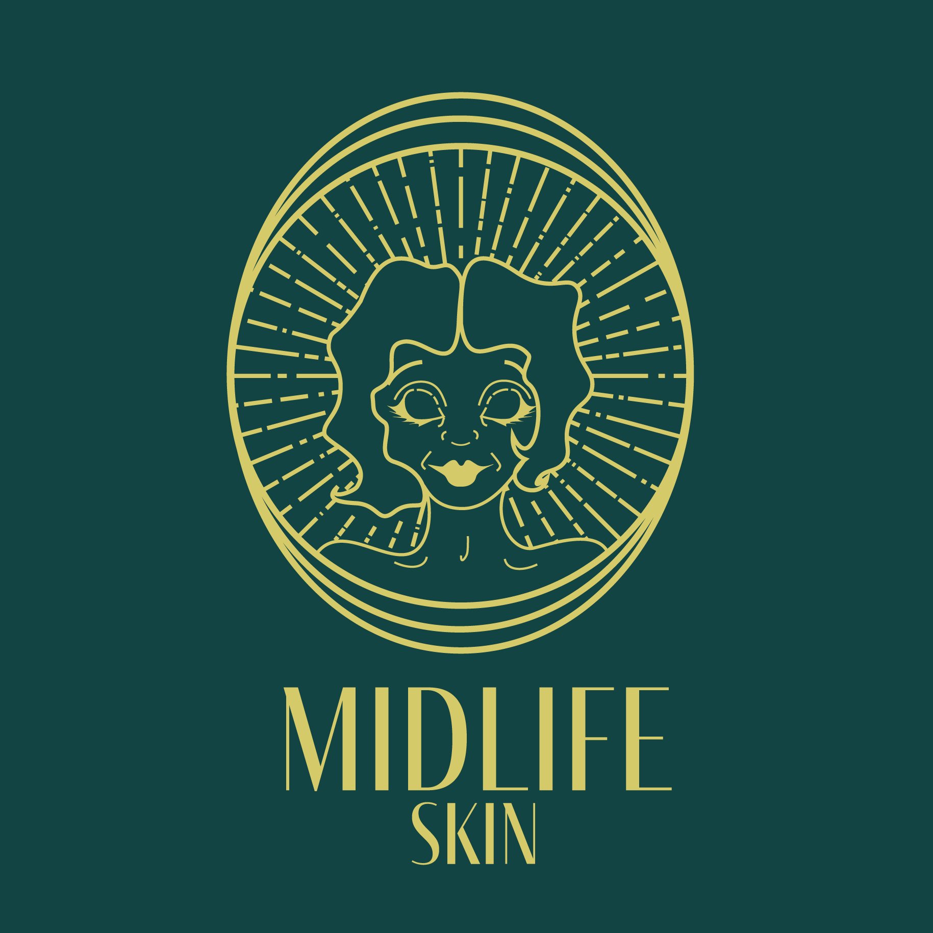
Kate didn’t have the budget for me to produce three different concepts for her, but fortunately, she really loved this but wanted the woman to have a gray streak of hair, like Stacy London. I also wanted to scale down the complexity of the image to make it more feasible to transfer upon different subjects.


my learning moments
This is one of the first projects that I worked on, and I felt pretty good about this project at the time.
Though, knowing what I know now as a more accomplished designer, I realize that the main logo with the woman is a bit too visually complicated still.
I specialize in vintage design styles, but I hadn’t dipped my toes too much in design inspired by Art Deco before. I felt confident that I’d be able to design in this style moving forward for other clients, as Art Deco is generally a bit more popular than the 1960s psychedelic/mod art that I tend to be drawn to.