“INTELLECTUALS…”

client
raffinand akiji
location
vancouver, british columbia, canada
bio
Raffinand Akiji is a filmmaker and artist from Vancouver, B.C.
He has written a new screenplay for a film based upon the play “Art” by Yasmina Reza, which he has renamed “INTELLECTUALS…” and updated it to modern times with diverse casting. It’s a comedy that satirizes elitist art communities, and Raffi wants me to help him out with a visual identity for the film so that he can sell the script to investors.
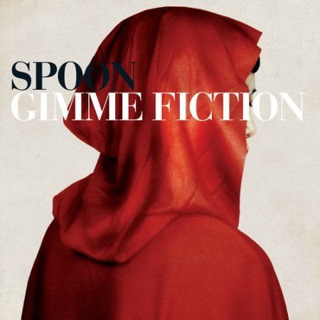
The film is about three 30-40 year old, wealthy friends who get in a friendship-breaking argument after one of them spends thousands of dollars on a completely white painting.
market
The kinds of people who would go to an independent movie theatre
College educated, wealthy, liberal
Art community
The kinds of people who donate to local public radio stations and their local symphony for the status symbol
The kind of student in a philosophy class who thinks he knows everything
Professors
Queer people in art community


brainstorming
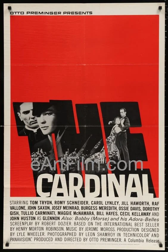
I looked up some posters from the original play. I liked some of them a lot but others were a bit corny.
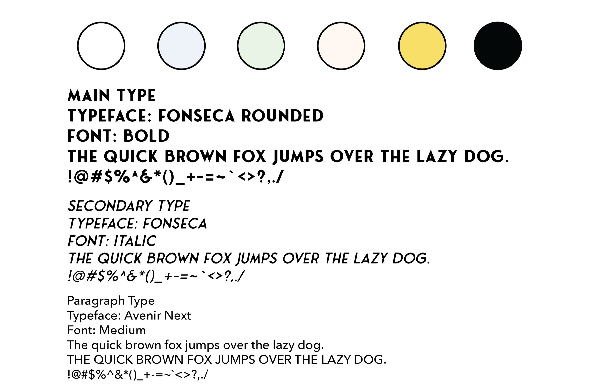
I wanted the look of the film to be in this kind of “artsy” minimalistic look. You know the look… a blank background with a Helvetica-type font that just screams “ART SCHOOL!” Something kind of Bauhaus-influenced. I thought some Saul Bass influence would fit well with what they are trying to go for as well.
Raffi and his business partner were in agreement with the idea for the idea of the look and wanted me to move forward with this influences in mind.


designing
Raffi wanted me to design a poster to go along with the branding, and so I started the design process with the poster in the front of the mind. I thought that a Futura-like typeface would be the best type that would work with what they were trying to go for.
Raffi selected the title “INTELLECTUALS…” with the ellipses and quotes around it to give it a sense of artistic mystique. It doesn’t really mean anything other than it’s something interesting looking.
I ended up coming up with a logo concept that complements it with the “…” part of it. It reminded me of some art pieces I made that were selected to be seen at a gallery at Western Washington University when I was a teenager. Many people kept asking me what it meant. It didn’t really mean anything, but I was amused that people assigned meaning to it. I think the “…” and “INTELLECTUALS…” way of presenting the title and brand information would bring that sense of mysteriousness that doesn’t actually mean anything. I think people would apply a lot of meaning to it in the same way that the main character applies meaning to a white painting.

I also wanted to play with the many shades that “white” can be. As accent colors, I chose extremely light versions of primary colors, nearly white. They are hard to see on the poster with a plain HEX#FFFFFF background, but that’s very much on purpose.
It’s meant to draw the eye in. Bring meaningless mystique.


feedback & edits
Raffi and his team were pleased by the concept and overall look of the branding and poster. They felt it was going in the right direction for the personality they were going for.
Raffi’s only requests were to take out the yellow from the color scheme and use a serif-style typeface rather than the Futura-like sans serif.


my learning moments
This was another project that I felt well suited for. I’ve known Raffi for years, and he and I have loved to experiment artistically and comedically when we were teenagers. (We were involved in theater together.) I knew his taste really well, and I loved his script. It was a lot of fun to bounce ideas off of him. He had a specific vision in mind, but I felt I was able to translate that pretty well.
Being a graphic designer is often like being an artistic translator for another person’s visions. And I think I did a good job of being able to figure out exactly what the client wanted, and then be able to push it a little further. Raffi trusted my vision, but I needed to get some of his team members on board.
As long as I explained myself well, they were pretty receptive. Raffi and I had some creative history together, and so we already had years of trust built in. I had to build that trust with his producer, and that just took a little time. Showing him the process video and explaining the concept thoroughly helped.